Catalogue-first navigation
Six categories are available from the hero and again as direct cards, so repeat buyers can move quickly without reading the entire page.
Wholesale catalogue prototype
Unofficial prototypeA broad wholesale catalogue made fast to understand and easy to enter.
A catalogue-led redesign concept for a Mostar wholesaler, connecting six product families with a clear B2B partnership story.
The brief
Give business buyers a quick route into a large catalogue while preserving the stability, history, and service expectations of a long-running wholesaler.
The product range crosses office supplies, school products, sanitation, travel, banking, and promotional material. Without a strong entry layer, that breadth becomes friction instead of value.
What was built
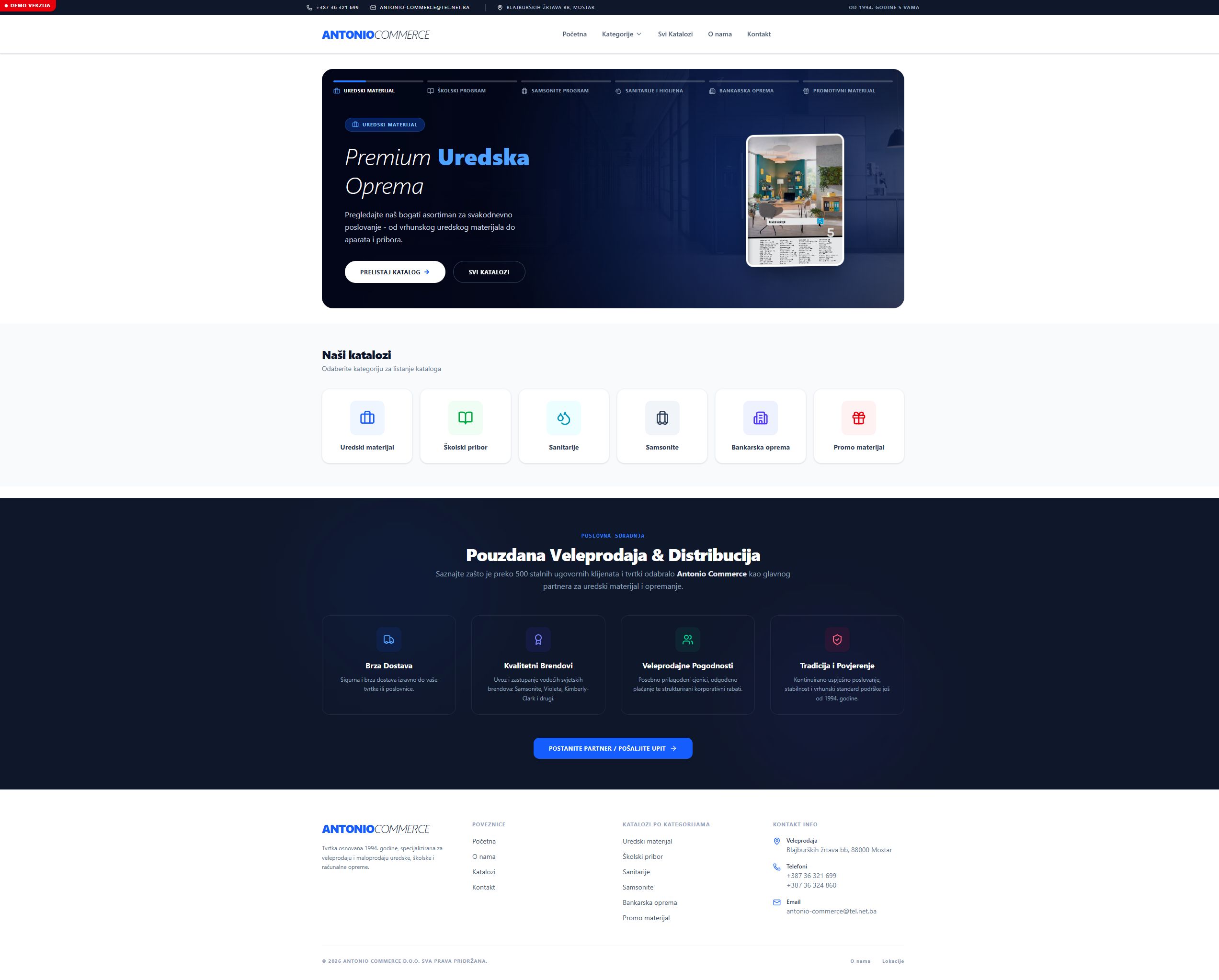
The prototype combines a crisp white catalogue surface with a deep navy partnership section. Electric blue creates a consistent action color, while compact cards make the product structure immediately scannable.
Six categories are available from the hero and again as direct cards, so repeat buyers can move quickly without reading the entire page.
Delivery, represented brands, wholesale terms, and continuity since 1994 turn operational strengths into a compact partnership argument.
Color-coded category icons, consistent cards, and a focused navy section create variety without losing the company’s identity.
Design decisions
The catalogue is grouped by the way buyers shop, replacing an undifferentiated product list with six clear doors.
Primary categories are repeated at the top of the experience to support visitors who already know what they need.
The partnership section focuses on delivery, brands, terms, and continuity instead of broad marketing language.
The outcome
Next case study 03 / 04
UNIS TŠP.